About Storecake
Storecake Branding:
Crafting a Distinctive Identity
At Pancake, we believe that a strong brand identity is the cornerstone of a successful business. Our branding strategy is meticulously designed to reflect the core values and mission of Storecake.io, ensuring a consistent and memorable experience for our users.

Storecake Design System:
Building Consistency and Efficiency
The Storecake Design System is the backbone of our user interface and user experience design, providing a cohesive and scalable framework for all our digital products.
Design System
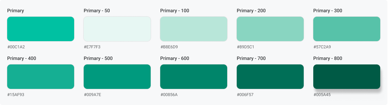
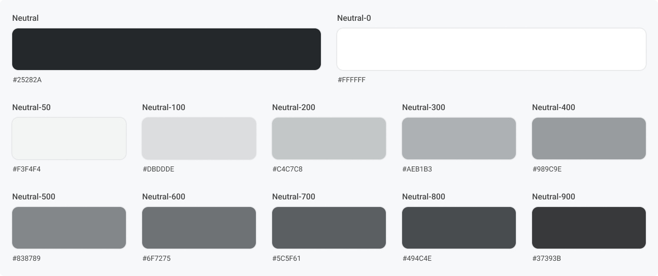
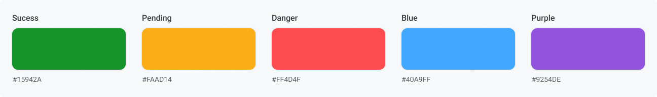
Color System
The color system in the Storecake Design System is carefully curated to enhance visual appeal and usability. Our colors are selected to evoke trust, reliability, and innovation.
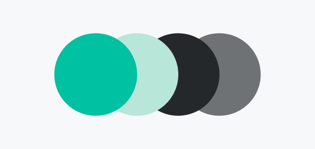
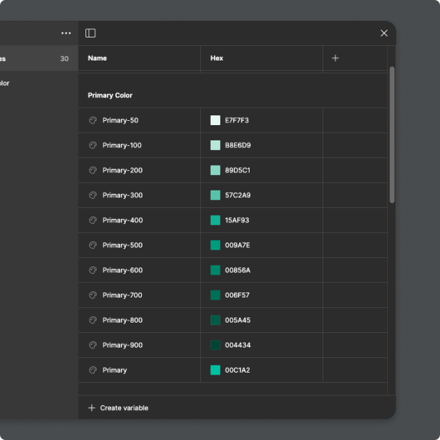
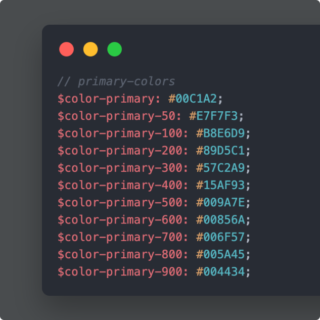
Primary Color
Neutral Color
Semantic Color
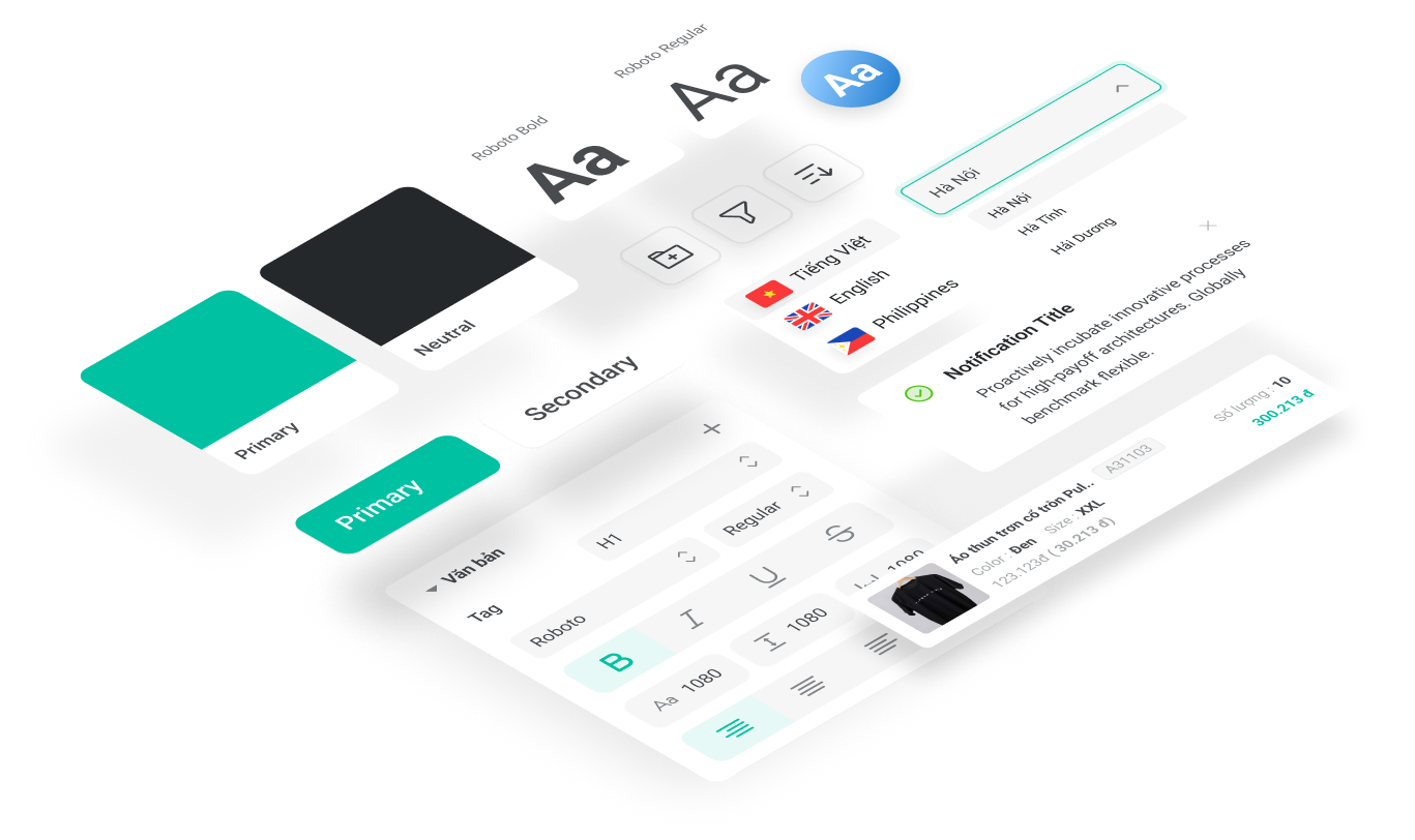
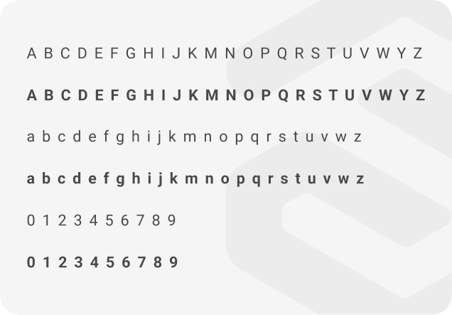
Typography
Roboto
Consistent and readable typography is a fundamental part of our design system. We use a modern, sans-serif typeface that ensures clarity and accessibility.

Storecake Design Token
To achieve consistency and optimize user experience, we have developed a robust Design Token system. StoreCake's Design Tokens serve as the fundamental components that synchronize design and development elements.
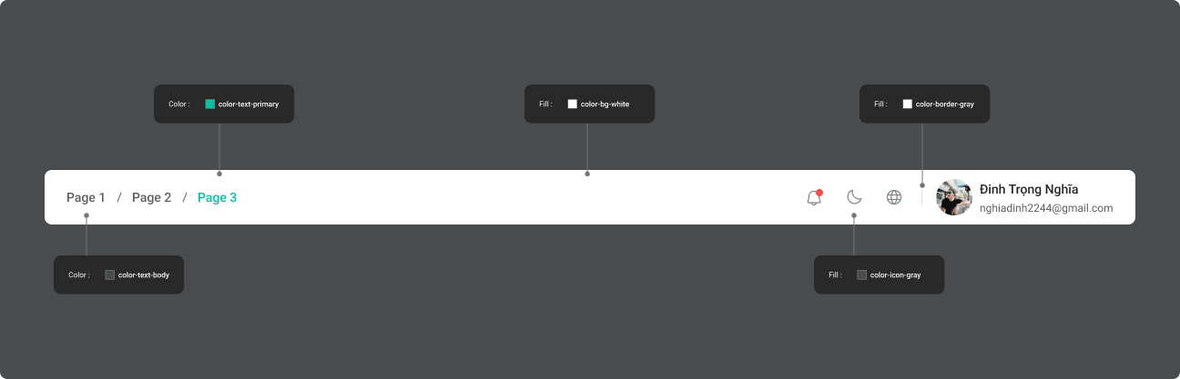
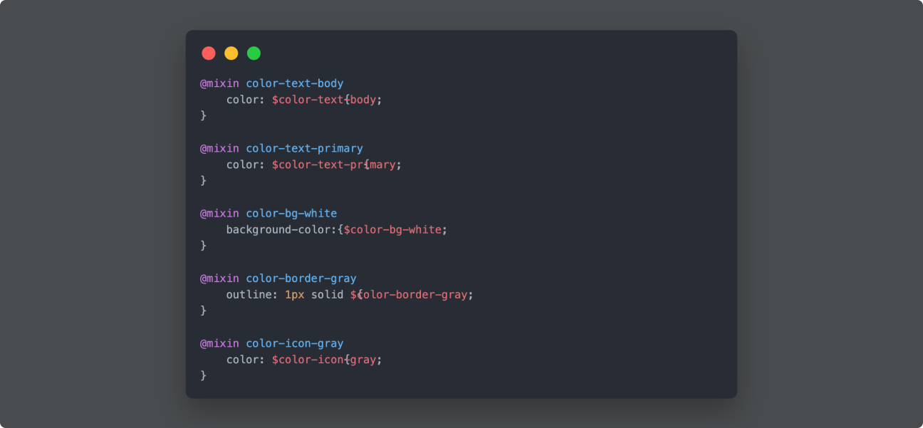
Design Token: Color System
Defining and standardizing color values as a single source of truth for designers and developers.
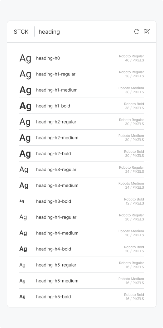
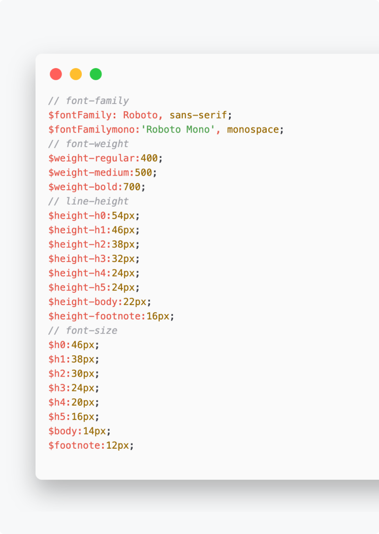
Design Token: Typography
Typography variables include font-family, font-size, font-weight, and line-height.
Storecake Design Token:
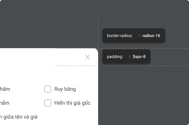
Sizes and Spacing
Clearly defined sizes and spacing between elements create a harmonious and visually pleasing layout, ensuring consistency across all interface components.

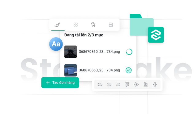
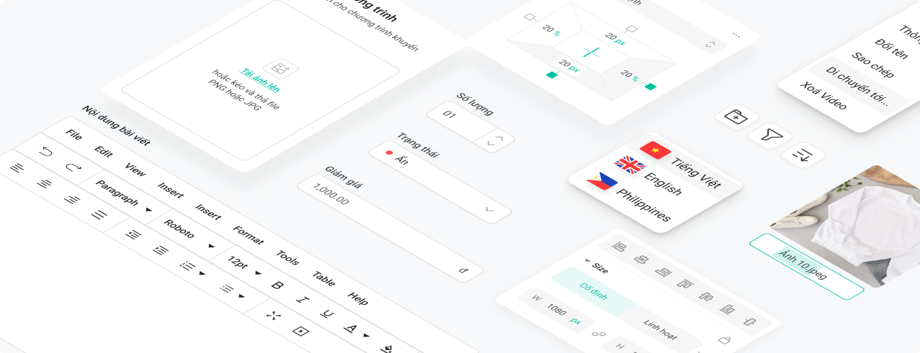
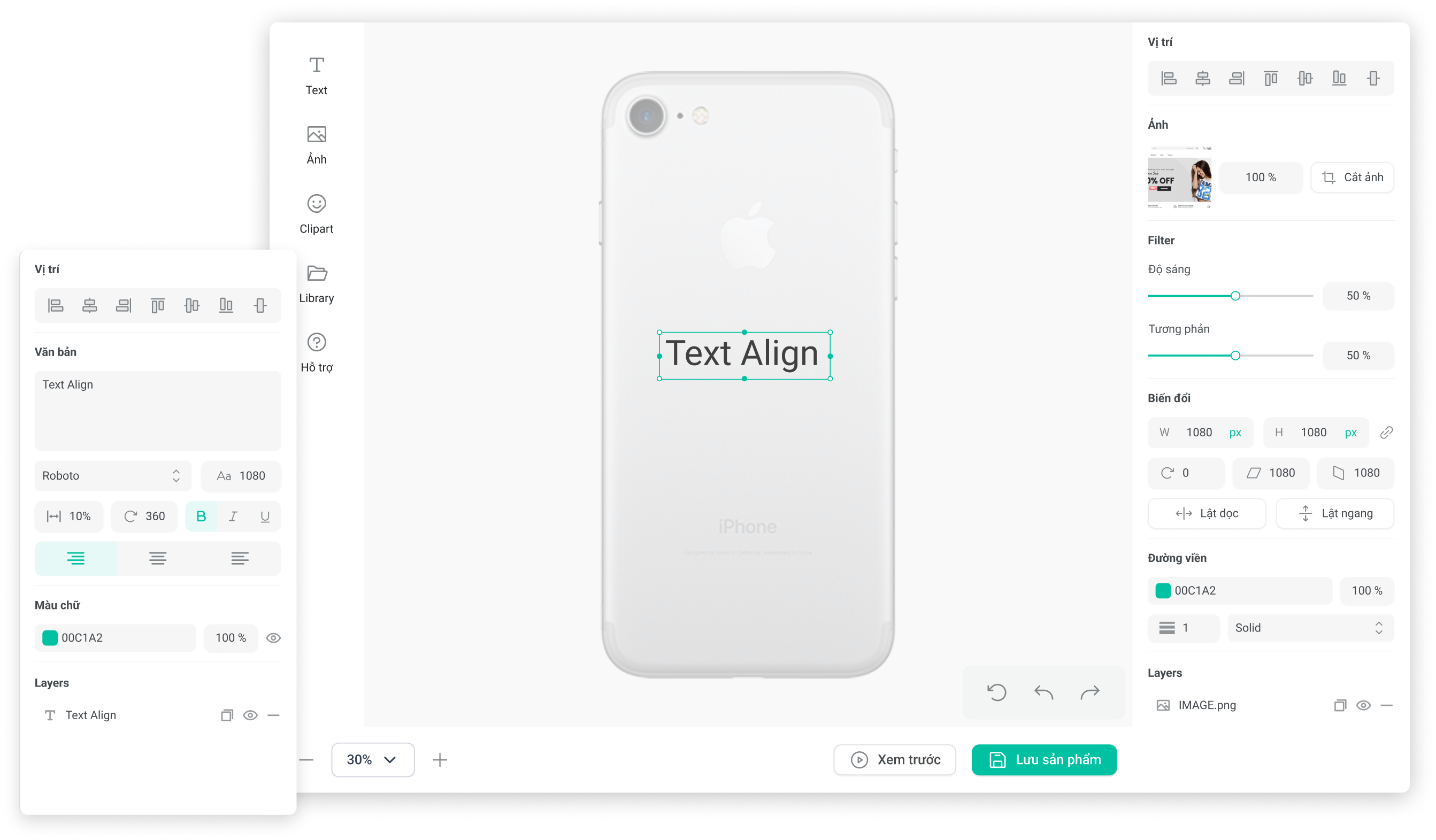
Components Library
Our component library includes a comprehensive collection of reusable UI elements such as buttons, forms, modals, and navigation bars. Designed for flexibility and consistency.
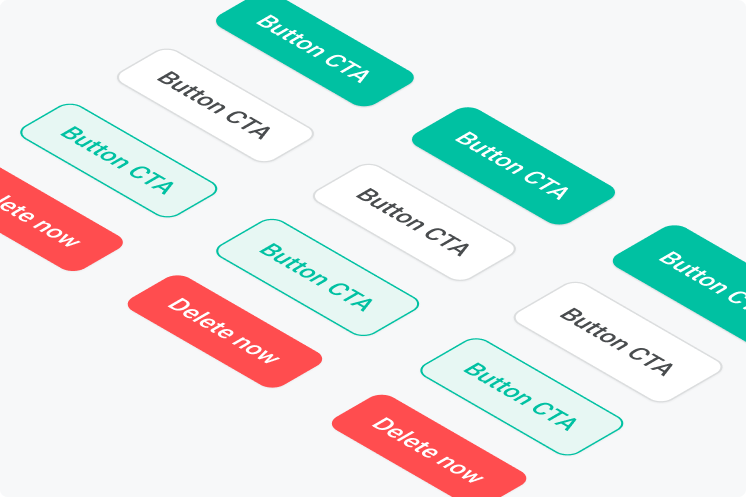
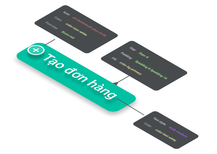
Button
The button component is crafted to ensure both aesthetic appeal and functional excellence. As a fundamental UI element, our buttons are designed to enhance user interaction.
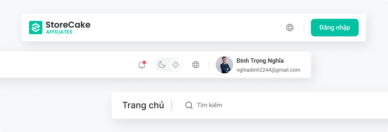
Navigation Bar
Other Components
Storecake Loaders
Custom animated loading states for a polished experience.
First Set Up
Dashboard Loader
Builder Loader
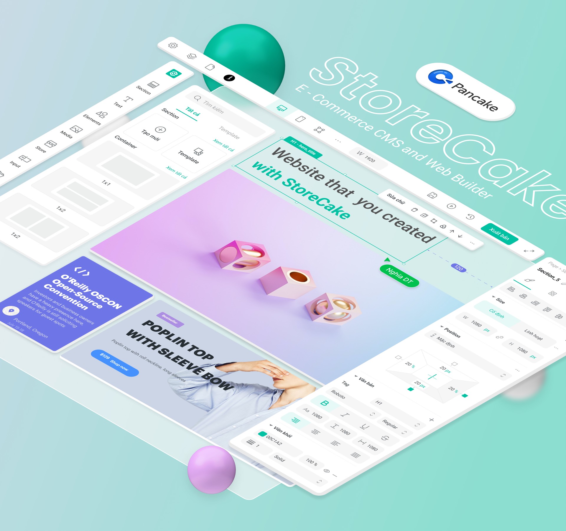
Product Showcase
A deep dive into the interface and features that power Storecake.io.
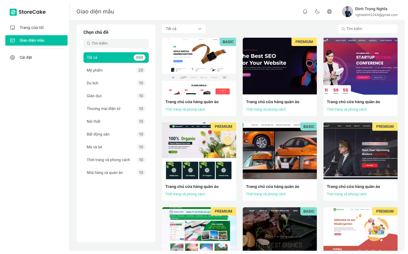
Website Template
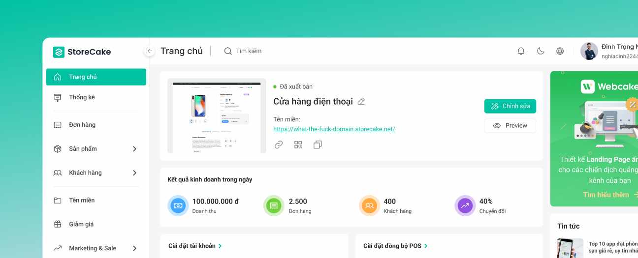
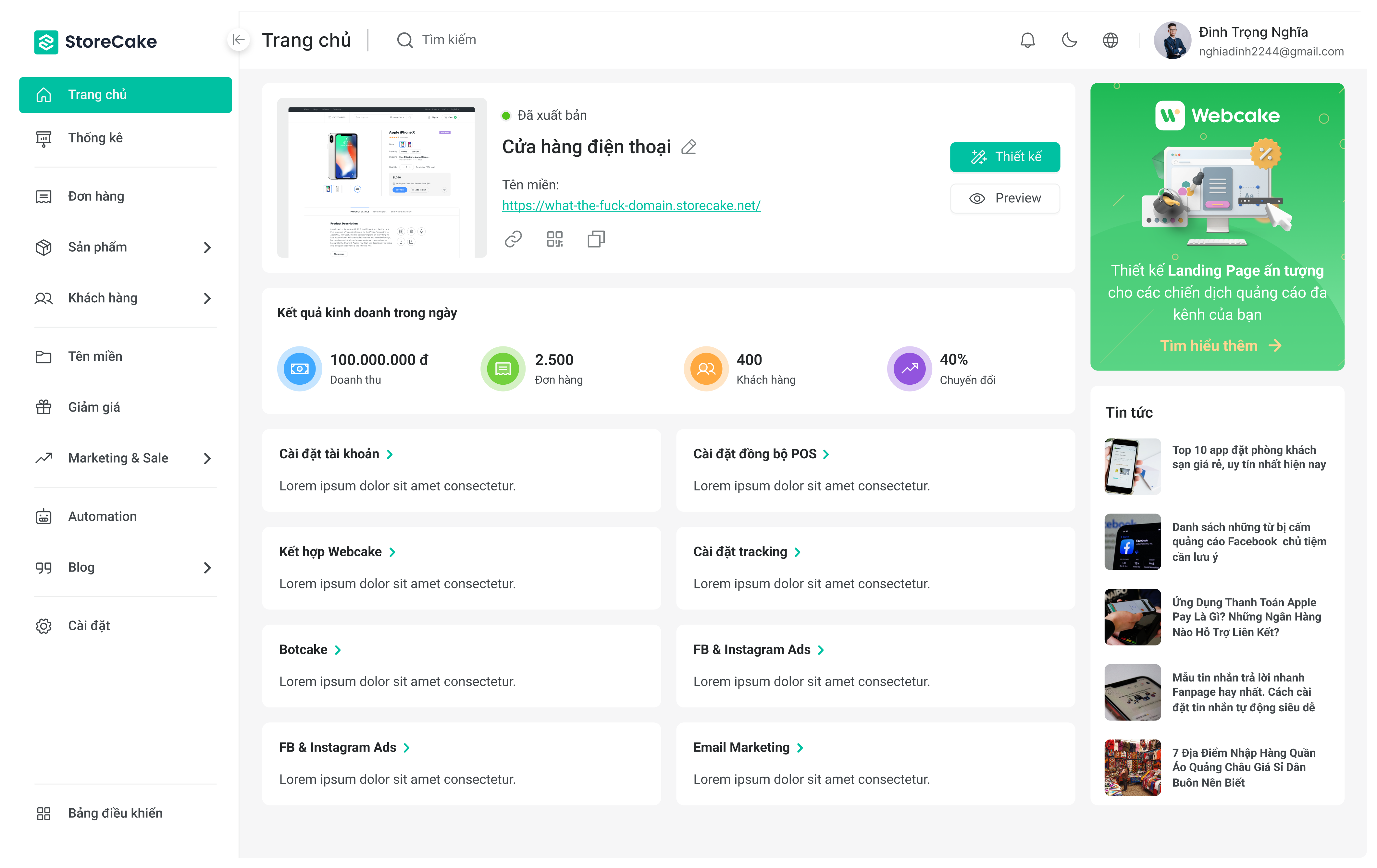
Main Dashboard
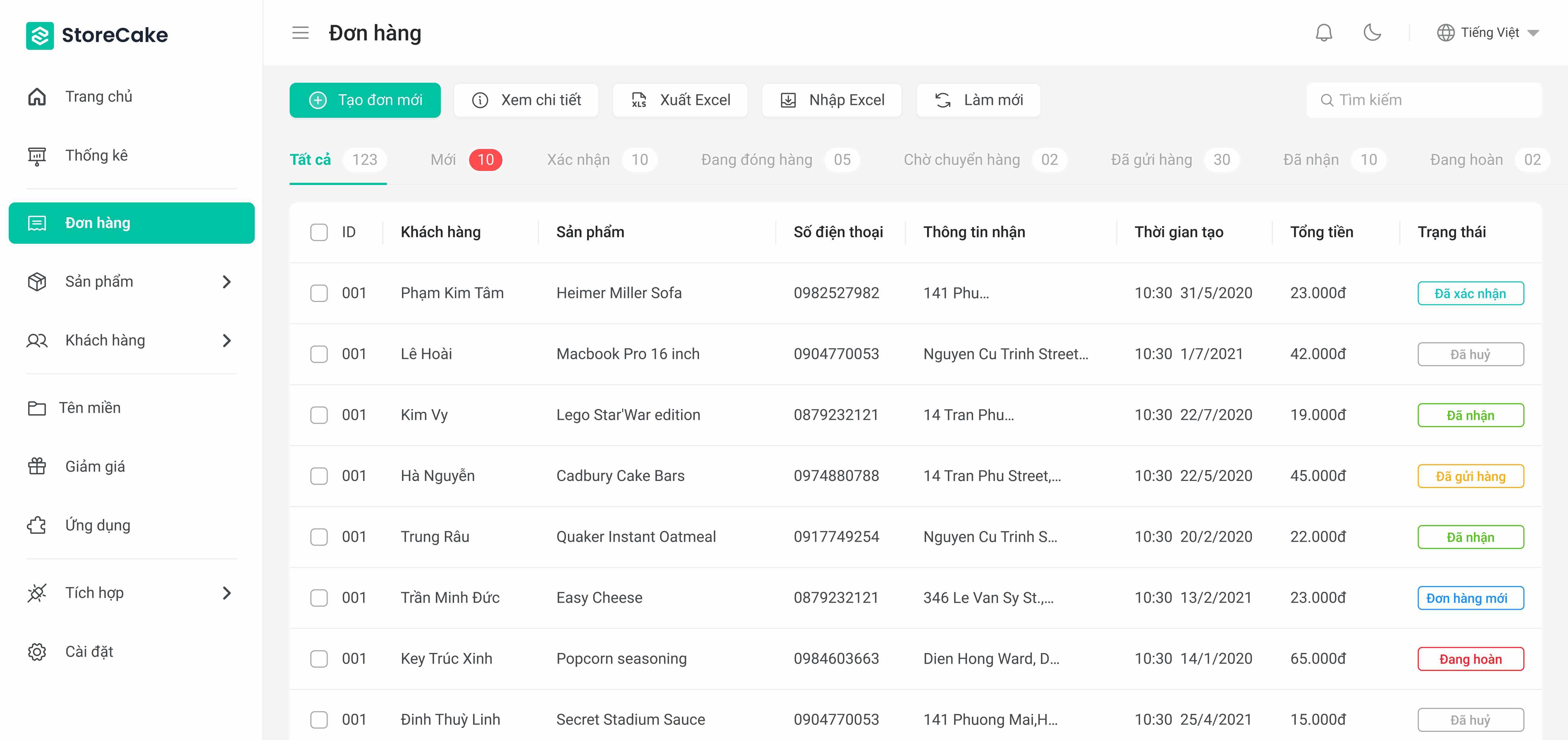
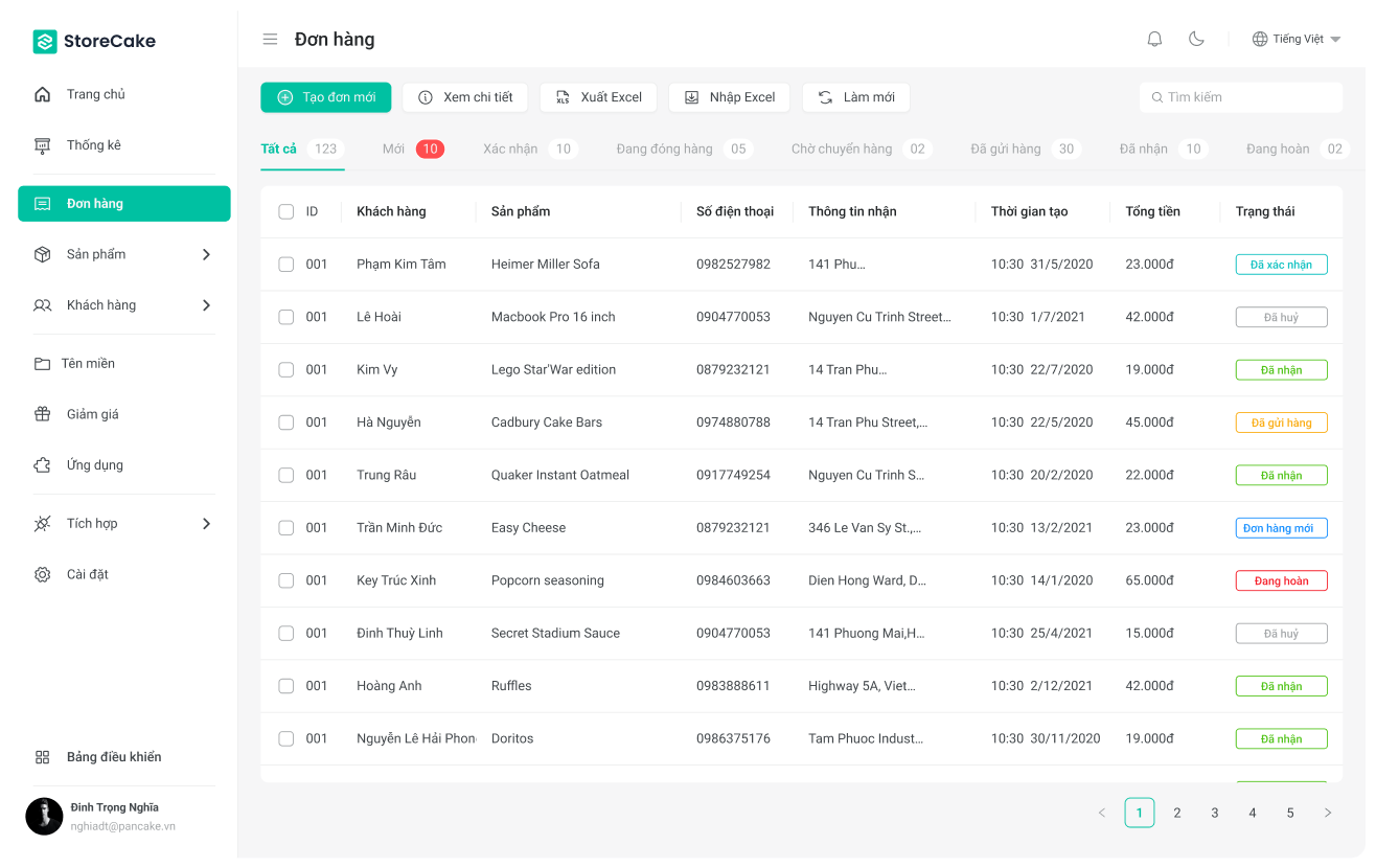
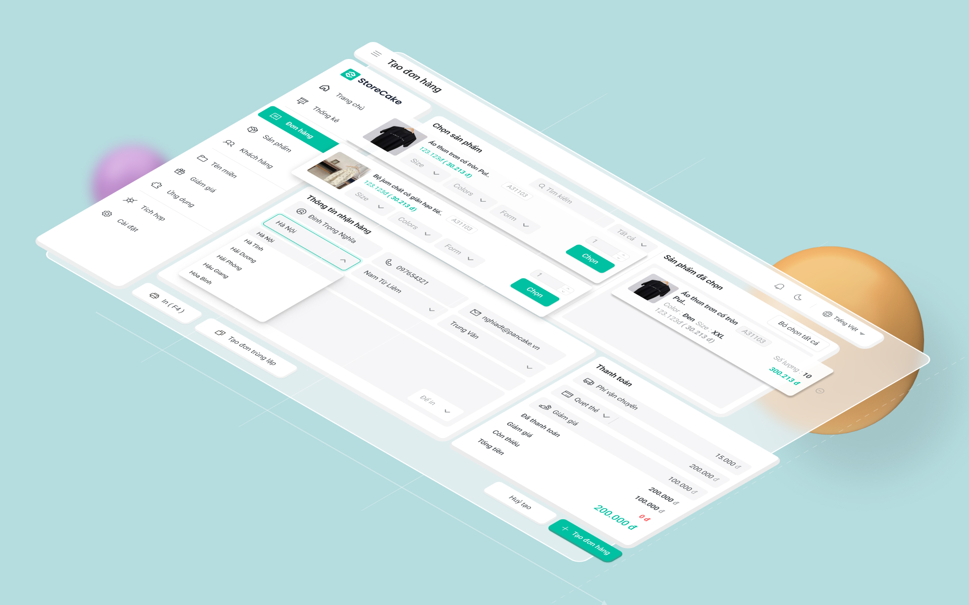
Order Management
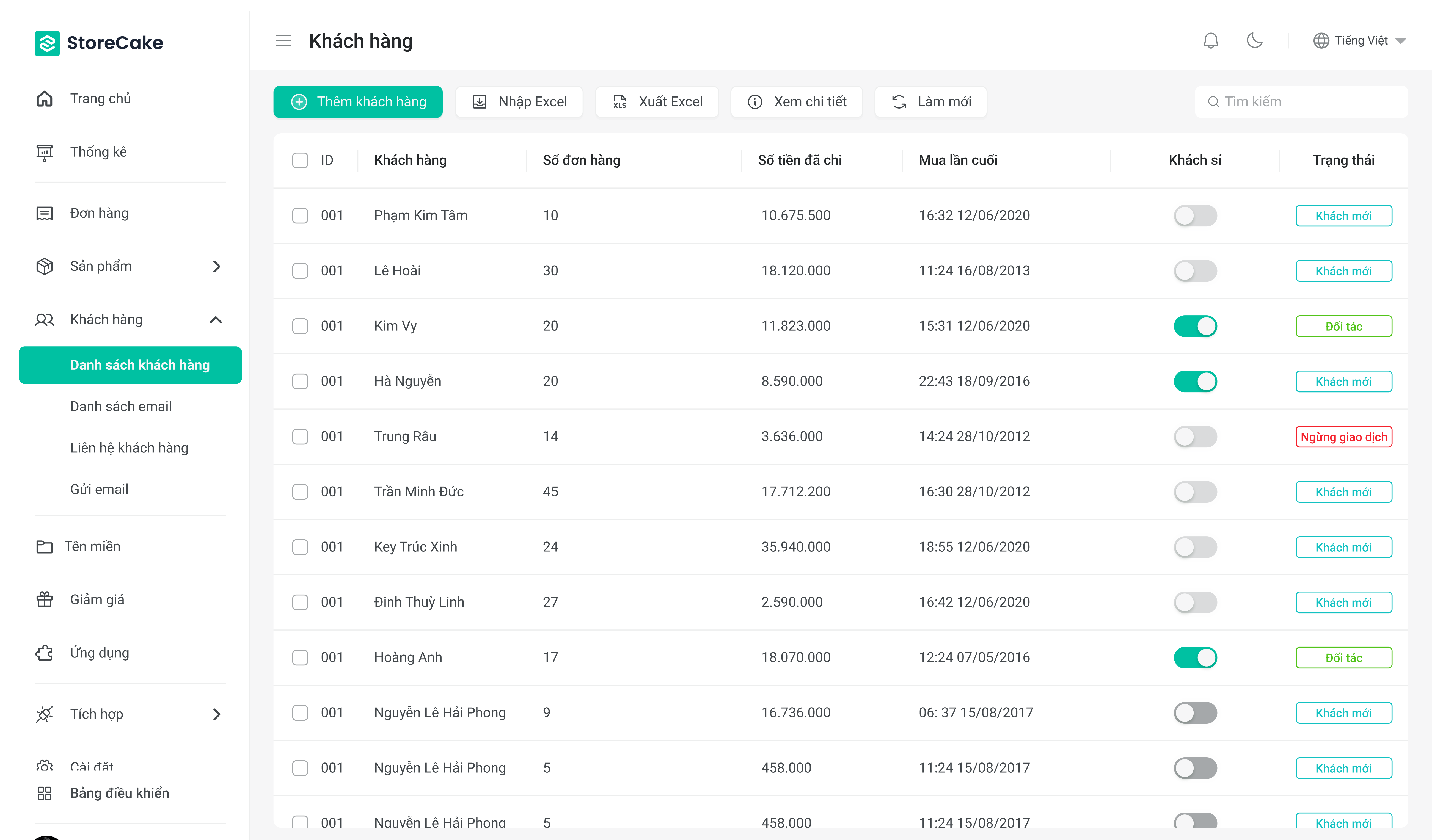
Customer Management
Storecake Web Builder
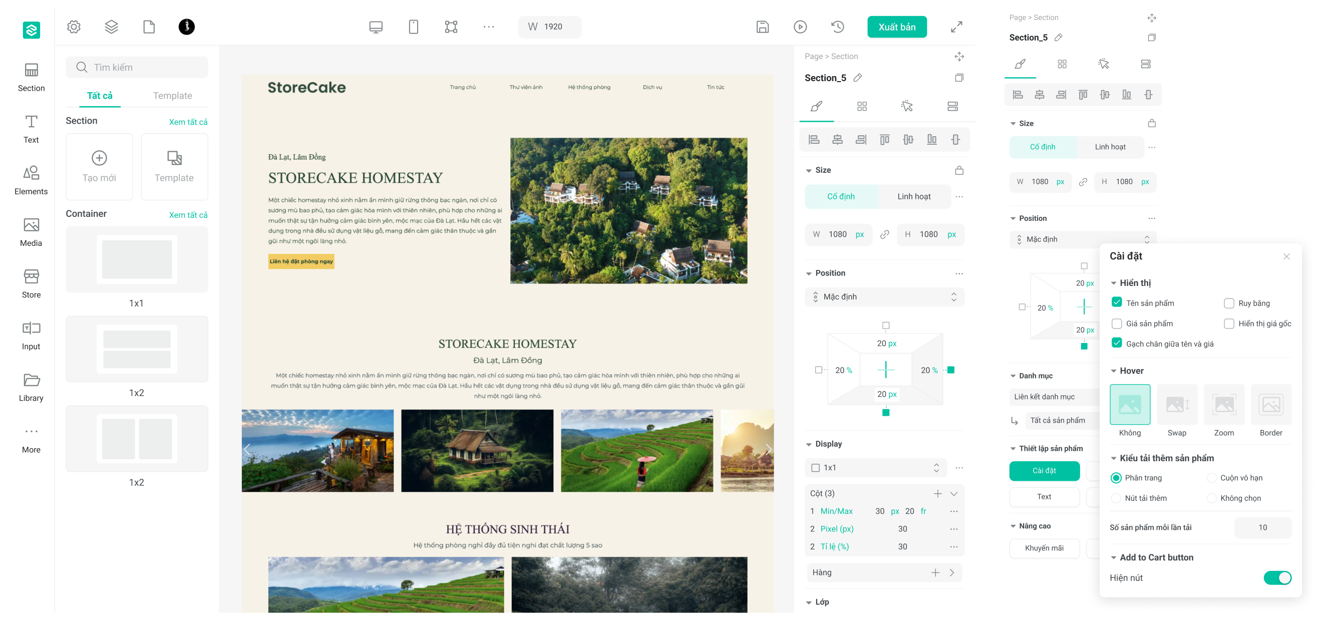
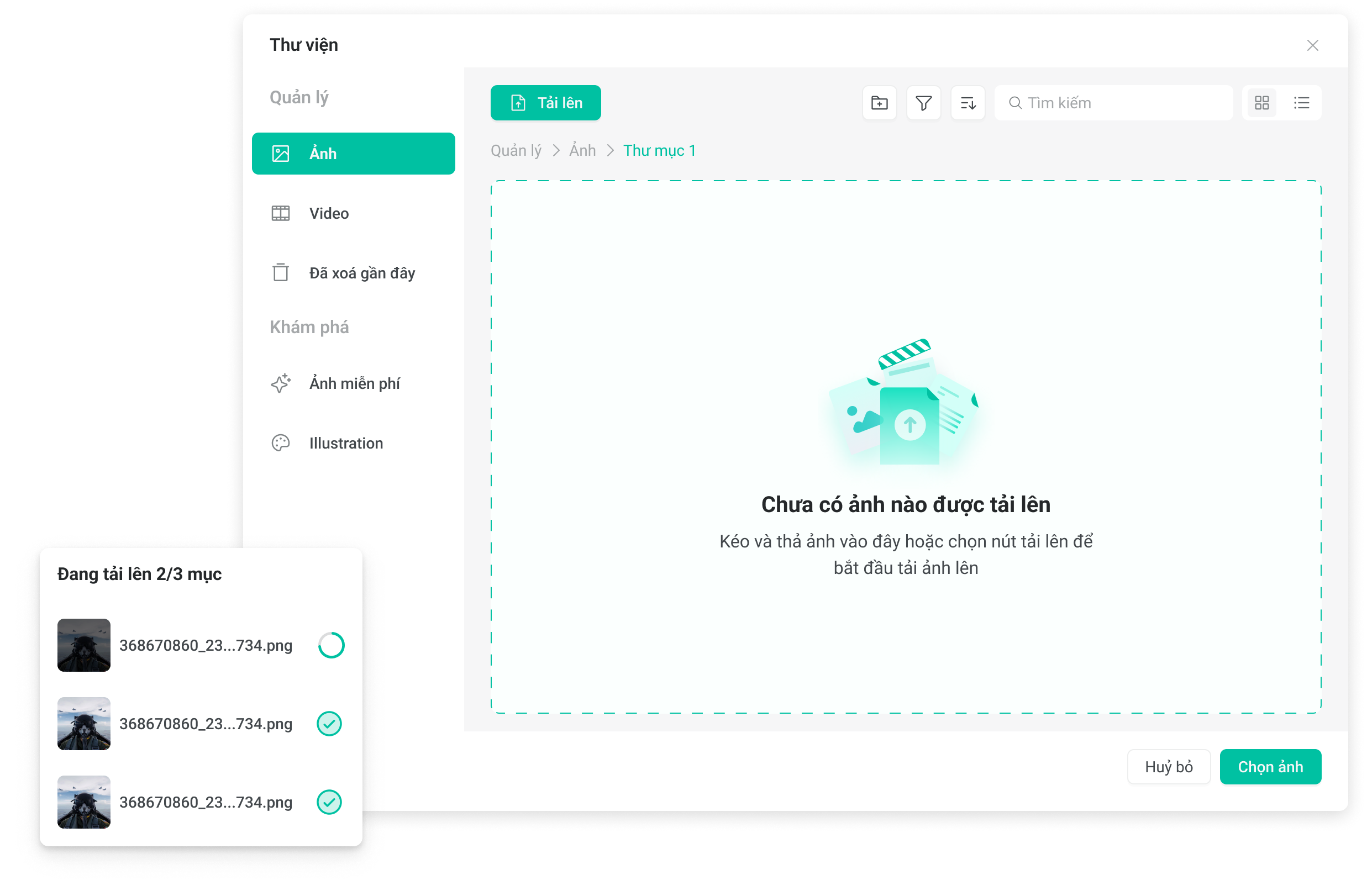
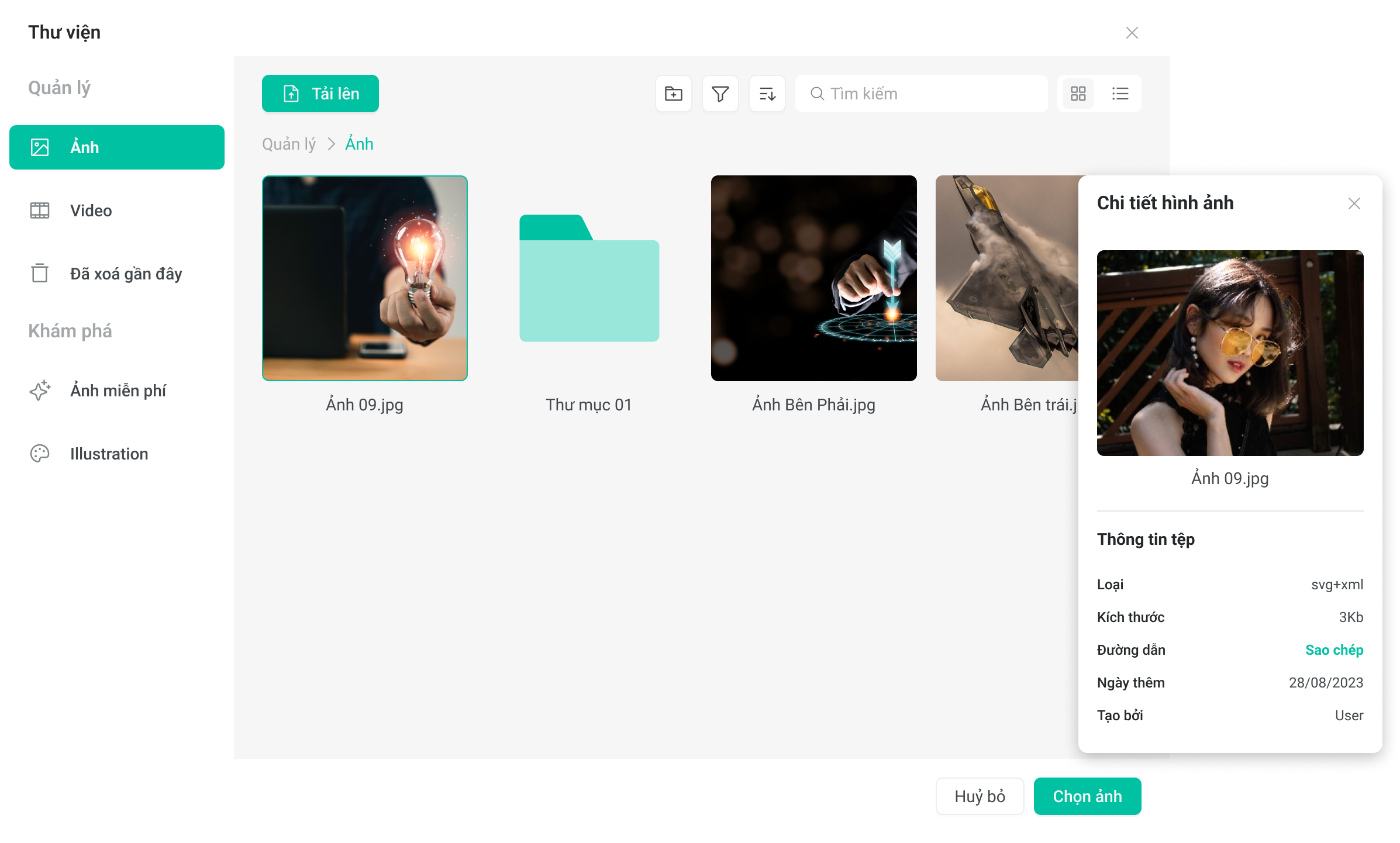
Builder Library
POD Design
More Work
Other projects.

Examdee
2025 — 2026Gamified learning platform for 120,000+ students.

DeeUI
2025 — 2026Design system for Examdee ecosystem.
Webcake Rebranding
2024 — 2025A modern, high-converting visual identity and interface redesign for Pancake's leading landing page builder.